
20 JUL 2026
Copy before design: why the words decide conversion
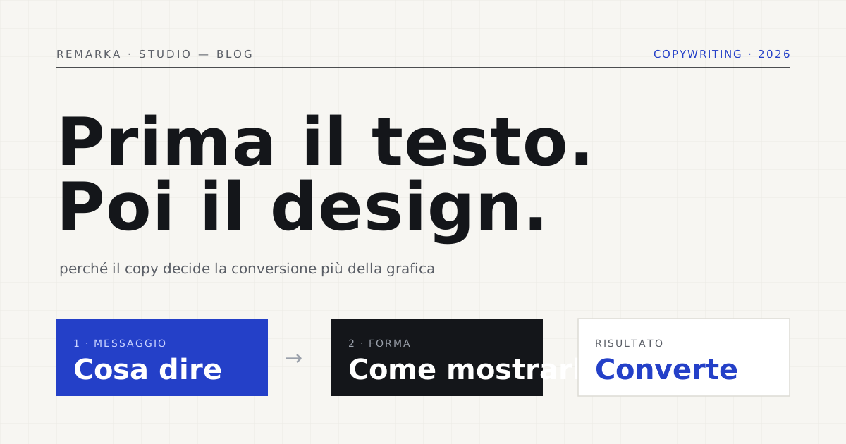
The script is always the same: you pick the template, decide the colours, sort out the graphics, and then “we’ll add the copy.” That copy arrives in a rush, written to fill spaces already decided, and the result is a gorgeous site that says nothing and doesn’t convert. It’s a mistake of order before it’s a mistake of writing: on the web the copy — the words — isn’t filler, it’s the skeleton. Design and copy should be thought through together, but if one of the two really has to come first, it’s the copy. Let’s see why a website’s copywriting decides conversion more than the graphics do.
Nobody reads, everybody skims.
Let’s start from how people actually use a page, because that’s where the first myth collapses. On the web nobody reads line by line: they skim. Nielsen Norman Group’s long-standing studies have documented it for twenty years — the eye jumps, looks for handholds, stops on headings and bold text, and when in doubt leaves. The gaze often follows an “F” shape: lots of attention on the first lines and the left column, less and less as it goes down.
This changes everything for the writer. An elegant wall of justified text with no handholds is invisible to a reader who skims. Copy that works is built to be skipped and understood anyway: headings that carry the meaning on their own, a first paragraph that answers straight away, bold on the words that matter, lists instead of long sentences. It isn’t writing “less”: it’s writing for the way people read on a screen.
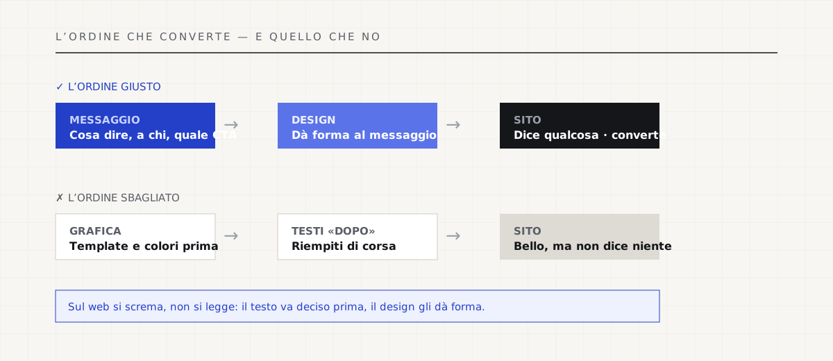
The design serves the message, not the other way around.
When the copy comes first, the design has a clear job: to highlight the right words. It knows what should shout and what can whisper, where a big headline is needed and where a list, how much room to give the call to action. The layout becomes a tool in service of a settled message. When the copy comes later, the opposite happens: the words get squeezed or stretched to fit boxes already drawn, and the message bends to the graphics. The result shows — pages that seem to say something without saying it.
It isn’t a matter of taste, it’s a matter of function. A button that reads “Send” converts less than one that says “Request the free quote”: same graphics, different words, different result. Microcopy — the two words on a button, the line under a form, the error message — shifts conversions as much as, and more than, a graphic restyle. And it’s copy, not design.
Write for the customer, not for yourself.
The second mistake, after order, is point of view. Most sites talk about themselves: “we’re leaders,” “we offer innovative solutions,” “our mission.” The visitor doesn’t care: they want to know whether you solve their problem, how, in how long, on what terms. Copy that converts turns the camera around — from “we are” to “you get” — and uses the customer’s words, not the industry’s jargon. The most serious guides to writing for the web, like the British government’s for its digital services, repeat the same thing: plain, concrete language, oriented to the reader.
Concreteness means numbers and deadlines in place of adjectives. “We deliver in three weeks, with the date in the contract” says more than “fast turnaround.” “Fixed price, no surprises on the invoice” says more than “tailor-made solutions.” Copy full of superlatives gives no information: it asks for trust without offering proof. Copy full of facts does the opposite — and Google, not by chance, rewards exactly this quality in its criteria for helpful content.
Measure the signals your site already sends Google →
What a business website includes, copy that converts and all →
Copy first in a restyle too.
It holds for a new site, but also — perhaps above all — for a restyle. The temptation, when redoing a site, is to focus on looks: new look, same old copy. It’s a wasted chance. A restyle is the best moment to put the message back in order before the graphics: what you want the visitor to grasp in three seconds, which action they should take, which doubts need clearing. The new design then gives shape to that cleaned-up message, instead of re-dressing the old one.
It’s the approach we hold when we rebuild or improve a site: first you decide what to say and to whom, then how to show it. A site that loads fast and looks good on a phone but says nothing stays a site that doesn’t convert. Graphics hold the gaze; copy turns the gaze into a decision.
Restyle and migration: new look, message brought back into focus →
Read also: the anatomy of a landing page that converts →
The right order: message, then form.
Let’s sum up, because it’s simple and almost nobody does it: first you decide the message — what to say, to whom, with which call to action — then the design gives it form. The copy is written for the skimmer, from the customer’s point of view, with facts in place of adjectives. The graphics, at that point, have a guide and don’t have to guess. It’s the order that turns a “pretty” site into a site that brings enquiries.
You don’t need to be a writer. You need to respect the order and the person who’ll read: say something true, say it clearly, say it first. Beautiful design on a muddled message is an elegant suit on someone with nothing to say. The right message, even in a plain outfit, sells. If you have to choose where to start, start from the words.
Sources.
The figures and claims in this article come from here. These are primary sources, not summaries: open them and check for yourself.
- Nielsen Norman Group — how people read on the webTwenty years of research: on the web people skim, they don’t read. Copy must be written for a jumping gaze.
- Nielsen Norman Group — the F-shaped reading patternThe eye follows an “F”: first lines and left column. Headings and the first paragraph carry almost all the weight.
- GOV.UK — writing for the web (content design)The British government’s guide for its digital services: plain, concrete language, on the reader’s side.
- Google — creating helpful, reliable contentGoogle’s quality criteria reward the same concreteness that convinces people: facts, not adjectives.
Let’s talk about your website.
Free analysis of your current website; a fixed quote within 24 hours of the call.