
21 JUL 2026
A landing page that converts: anatomy of a page that brings enquiries
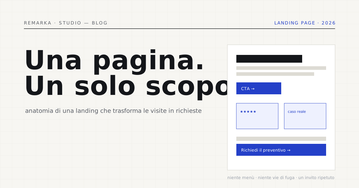
You launch a campaign, send people to the site’s home page, and the enquiries don’t come. It isn’t the campaign’s fault: it’s that the home page has ten purposes and therefore none. A landing page that converts does the opposite — it has one goal, and everything, from the first line to the button, serves that goal. In this article we take it apart piece by piece: how a page that turns a visit into an enquiry is built, section by section, with the reasons behind each choice.
What a landing page is (and why it isn’t the home page).
A landing page is the page where someone arriving from a campaign, an ad or a targeted link “lands.” The difference from the home page isn’t length: it’s purpose. The home page is a switchboard — it routes towards services, about us, blog, contacts. A landing has a single exit door: the action you want, whether that’s a quote request, a booking or a download. Anything that doesn’t lead to that door is noise, and it has to go.
From this comes a rule that catches people off guard: on a landing page that converts you remove elements, you don’t add them. Out goes the navigation menu with ten items, out go the links that lead elsewhere, out go the distractions. Every extra choice offered to the visitor is one more chance not to decide. The page has to make the desired action the easiest and most obvious thing to do.
The anatomy, top to bottom.
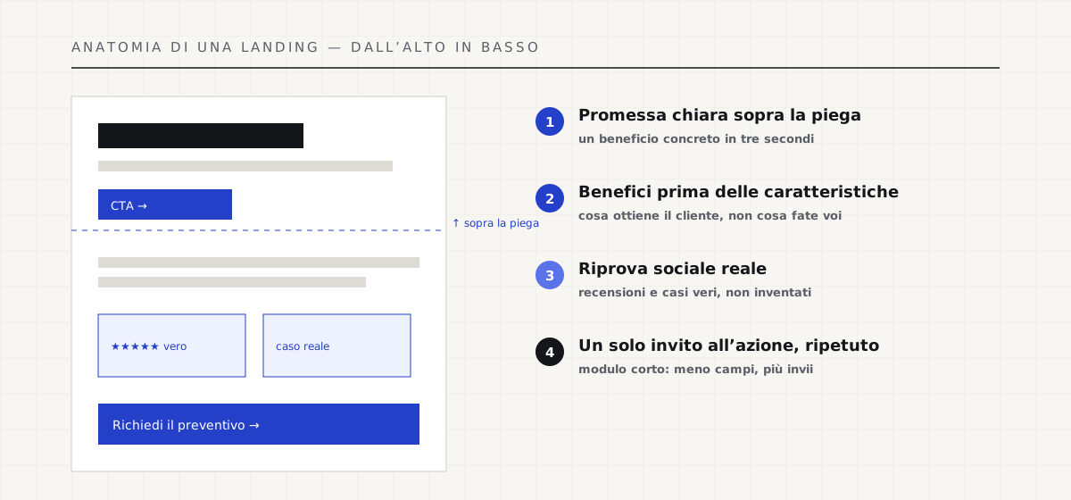
An effective landing follows a proven structure, and every block has a job. At the top, what’s visible without scrolling must answer, in three seconds, “what is this and why does it concern me”: a headline that promises a concrete benefit, a line of subhead that explains it, a first call to action. People decide quickly whether to stay, and they do it from what they see right away.
Going down, the page makes its case: benefits before features (“delivery in three weeks with a date in the contract,” not “agile methodology”), objections faced head-on, the proof that backs up what you promise. Each section removes a doubt. At the end — and repeated along the way — a single call to action, always the same, always clear.
Proof counts more than promises.
The centre of gravity of a landing is social proof: the demonstration that others, before this visitor, trusted you and did well. Real reviews, real cases with numbers, client logos, an honest counter. But it only works if it’s authentic: a made-up testimonial can be smelled a mile off and destroys, in one stroke, the very trust you wanted to build. Better a few real proofs than many inflated ones — and we’ve devoted a separate guide to honest social proof.
Next to the proof sits the form, the point where the promise becomes a contact. Here the rule is clear and confirmed by every usability study: fewer fields, more submissions. Ask only for what’s needed to take the first step. A form with twelve fields says “this will take time and effort”; one with three says “it’s a click away.”
How to collect reviews without inventing them →
Fast, mobile and readable: otherwise nothing converts.
The most persuasive landing in the world won’t convert if it loads in five seconds or is unreadable on a phone. Speed is part of the message: a page that snaps into view signals seriousness before the words do, and Google rewards it with Core Web Vitals. On a landing, where every visit is often paid for, slowness is money burned twice — in the ad and in the lost conversion.
Mobile comes first, not last. Most campaign traffic arrives from a phone, so the page must be designed from that screen: a headline that fits whole, a big button within thumb’s reach, a form you fill in with one hand. And the copy has to be written to be skimmed — headings, bold text, short lists — because on the web nobody reads line by line: they scroll. It’s the foundation of the technical SEO and content we deliver, not a final touch-up.
Technical SEO and speed as standard on every page →
Before you launch: measure the page’s speed and health →
One page, one purpose, measured.
The secret of a landing page that converts isn’t a magic button colour: it’s the discipline of a single goal, defended by removing everything else. A clear promise up top, arguments that remove doubts, real proof, a short form, a repeated call to action, flawless speed and mobile. None of these elements is a trick: they’re how you respect the time and the decision of whoever has arrived.
And like everything that matters, it’s measured. A landing is judged on a number — how many visits become enquiries — and improved one hypothesis at a time, testing and comparing. Building the page is half the work; the other half is looking at the data and correcting. That’s how a page goes from 1% to 3% without spending a euro more on advertising.
Sources.
The figures and claims in this article come from here. These are primary sources, not summaries: open them and check for yourself.
- Nielsen Norman Group — how people read on the webPeople skim, they don’t read: the page must be built for a fast glance, not for linear reading.
- Baymard Institute — checkout and form usabilityYears of testing forms and payments: every extra field is a lost enquiry. Fewer fields, more submissions.
- web.dev — Web VitalsSpeed is part of conversion: on a paid-traffic landing, every second lost is money burned twice.
- Google — creating helpful, reliable contentWhat Google considers quality: the same clarity that convinces people convinces the engine too.
A site and a landing that bring enquiries, at a fixed price →
Let’s talk about your website.
Free analysis of your current website; a fixed quote within 24 hours of the call.