
23 JUL 2026
Images and speed: WebP, lazy-load and Core Web Vitals

If your site is slow, chances are images carry most of the blame. On most pages they’re the heaviest content by far, much more than text or code: a single photo loaded at full resolution can weigh as much as dozens of written pages. The good news is that images are also the point where optimizing pays off the most and costs the least: the right format, lazy loading and correct sizing are enough to turn a slow page into a fast one. Let’s look at how to optimize a site’s images with WebP, lazy-load and an eye on Core Web Vitals.
Why images weigh so much.
Open any page and, almost always, the heaviest thing to download is the images. State-of-the-web reports have confirmed this for years: they’re at the top of the ranking for bytes transferred, often more than everything else combined. The reason is simple — a detail-rich photo contains an enormous amount of information — but the consequences aren’t: every extra megabyte is waiting time, especially for someone browsing from a smartphone on a slow network.
The trouble is that many images are heavier than they need to be, out of pure oversight. Photos uploaded at 4000 pixels wide and then shown in a 400-pixel box; old, bulky formats where a modern one would do; no compression. It’s dead weight: information the user will never see, but that their phone still has to download. Optimizing images means removing that unnecessary weight without any visible difference.
WebP (and AVIF): the right format.
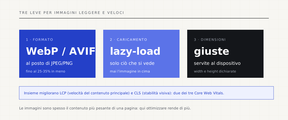
The first step is changing format. Old JPEGs and PNGs work, but they’re heavy: modern formats like WebP — and the more recent AVIF — offer the same visual quality while taking up much less space, often 25-35% less than an equivalent JPEG, sometimes a lot more. To the eye, nothing changes; for loading time, it’s a huge difference. Today WebP is supported by every major browser: there’s no longer a reason to ship needlessly large files.
The nice part is that you don’t need to redo the photos: you convert the existing ones, ideally automatically on upload, serving the modern format to whoever supports it. It’s one of the interventions with the best ratio of effort to result: you touch the file, not the design, and the page instantly gets lighter. Well-tuned compression does the rest without denting the perceived sharpness.
Measure your page weight and site speed for free →
Lazy-load: loading only what’s needed.
The second move is not loading everything at once. When you open a long page, the images further down — the ones you’ll only see if you scroll, and only if you do — aren’t needed in the first instant. Lazy-load defers them: the browser downloads what’s visible first and loads the rest only as the user gets close to it. The result is a page that appears ready much sooner, because it doesn’t wait for images nobody is looking at yet.
Today lazy-load is almost free to turn on: just a standard attribute on the image, `loading=”lazy”`, and browsers do the rest. Watch out for one thing: it shouldn’t go on the most important image at the top of the page, the one the user sees right away — deferring it would make perceived speed worse instead of better. Lazy-load is for what’s below the fold, not for the star of the page.
The right sizes and Core Web Vitals.
The third pillar: serve every image at the size it will actually be shown at. There’s no point sending a 3000-pixel photo to a screen that will display 600. The techniques for this — responsive images that adapt resolution to the device — avoid downloading pixels nobody will see. And you should always specify the image’s width and height, so the browser reserves the space in advance and the page doesn’t “jump” while loading: that jump even has its own metric, the CLS in Core Web Vitals.
This is where it comes full circle with the speed Google measures. The large image at the top is usually the element that decides your LCP — the metric measuring how long it takes for the main content to appear. Lightening it with WebP, giving it the right size and not lazy-loading it is often the single change that moves a page from orange to green. Images and Core Web Vitals are, to a large extent, the same problem.
Light, not heavy.
Optimizing images isn’t some technical whim: it’s the fastest, most concrete way to make a site fast, and therefore more welcome to visitors and to Google. Modern format, lazy loading, correct sizing: three interventions that don’t touch the design but change the experience, especially on mobile and slow networks — that is, for the majority of people visiting you today.
In the sites we build, images are treated this way by default: converted to modern formats, served at the right size, with lazy-load where it’s needed. It isn’t an extra to sell separately, it’s the minimum for a page full of photos to stay light. A site that’s beautiful but heavy isn’t a good site: it’s a page visitors won’t wait to see load.
Redesign and migration: getting a slow site back into shape →
Read also: INP, the new Core Web Vitals metric →
Sources.
The figures and claims in this article come from here. These are primary sources, not summaries: open them and check for yourself.
- web.dev — Learn Images (Google)The official course on images for the web: formats, compression, responsive images. Practical and up to date.
- web.dev — serving images in WebPWhy and how to use WebP: the same visual quality with files much lighter than old JPEGs and PNGs.
- MDN — Lazy loadingThe reference guide to lazy loading: how the loading=”lazy” attribute works and when (not) to use it.
- web.dev — Largest Contentful Paint (LCP)The Core Web Vitals metric most tied to images: often it’s the photo at the top that decides your LCP.
Let’s talk about your website.
Free analysis of your current website; a fixed quote within 24 hours of the call.