
22 JUL 2026
E-commerce that sells: the checklist before launch
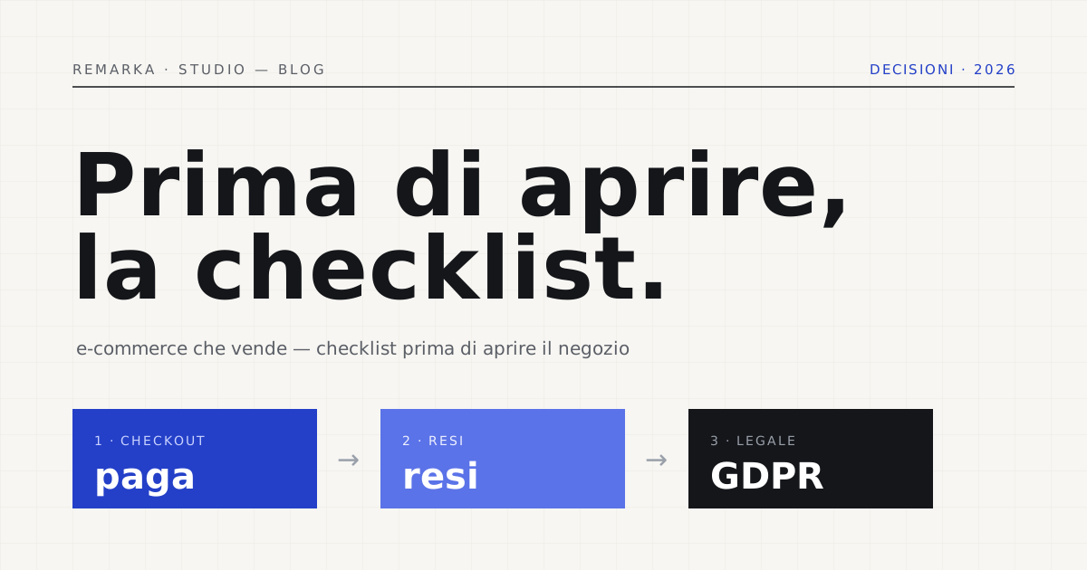
Opening an e-commerce site is easy; making it sell isn’t. Every so often we come across online shops that are technically flawless — nice photos, a curated catalogue, the right domain — that don’t generate a single order on launch day, because something simple slipped through: a missing payment method, a shipping cost that only shows up at the very last step, no cookie banner. That’s why, before you hit “publish,” you need a checklist before opening an e-commerce site that covers the points that genuinely decide whether a visitor buys or abandons the cart: payments, shipping, product pages, search and speed, legal obligations on privacy and consumer rights. It isn’t a theoretical list: these are the five checks we run before every launch, one by one.
Payments: the first item on the checklist, and the most decisive.
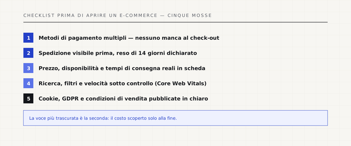
Let’s start with the point that decides the sale at the photo finish: payment. If, at the moment of paying, the customer doesn’t find the method they usually use — card, PayPal, a wallet like Satispay, increasingly common in Italy — the cart stays full and the shop takes in nothing. The rule is simple: the more payment options you offer, the fewer people abandon right at the last step. You don’t need to integrate them all from day one, but at least a card, a digital wallet and — if you sell at a higher average order value — instalment payment are by now the standard customers expect, not a luxury.
The number of steps matters too: a checkout compressed into a single page, with the accepted payment methods already shown in the cart rather than discovered only at the last click, cuts down the chances of second thoughts. Every extra screen between “I want to buy” and “I’ve bought” is a point where the customer can get distracted, close the tab, put it off till tomorrow — and tomorrow, as we know, often doesn’t come.
Perceived security matters as much as the real thing: HTTPS across the whole site, not just on checkout, a visible padlock in the address bar, and no card data that passes through or is stored on your servers — that’s the payment gateway’s job, and it must be PCI-DSS certified. Here, in a quick visual summary, are the five checklist items we cover in this article, one by one.
Shipping and returns: clear away the surprises at checkout.
The second item is the one that quietly sinks more carts than any other: the shipping cost that only appears at the very last step of checkout. The Baymard research centre, which has spent years studying the usability of the world’s biggest e-commerce checkouts through repeated user testing, points to exactly these extra costs discovered too late — along with being forced to create an account before even seeing the total — as some of the most recurring causes of abandonment. The fix costs nothing: show the shipping cost, or at least an estimate, already on the product page or in the cart, not at the end.
The same logic applies to returns: across the whole European Union, anyone buying online has 14 days’ right of withdrawal, with no need to justify the reason. Hiding it, or writing it in tiny print at the bottom of the page, doesn’t make it any less your obligation — it just makes it less clear to the buyer, and a customer who can’t find the returns policy before buying often gives up for exactly that reason. Realistic delivery times, a named courier, an explicit return cost: three lines that remove a huge doubt before it’s even raised.
One practical touch worth adding to the checklist: a shipping calculator visible right on the cart page, using the customer’s postcode, instead of pushing the figure to the final checkout screen. It costs little to implement and removes the surprise most often cited by people who abandon an almost-finished online purchase.
Product pages that convince, not just nice photos.
Curated photos help, but a product page that sells answers practical questions before the customer even asks them: is the price VAT-inclusive? is it in stock or does it need to be ordered? how long will it take to arrive? Every “contact us for the price” on a product that could well have a public price is one more obstacle, not a touch of elegance — and people searching online usually go to the competitor who does write the price.
If you publish reviews, make sure they’re true down to the last comma: no brand-new shop already has a hundred five-star reviews, and readers notice. Better zero reviews with a clear promise — tracked shipping, email support with a stated response time — than a showcase of invented testimonials: it only takes one doubt to make someone close the page and never come back.
A lot of this also depends on the platform you build the shop on: some handle variants, stock and returns better than others, and choosing it is a decision to make with a clear head, not halfway through the project. We’ve written an honest comparison about it, useful if that box on your checklist still needs ticking.
E-commerce platform: which one to choose →
Search, UX and speed: the shop also has to actually work.
A catalogue with more than a handful of products needs an internal search that genuinely works and filters — category, price, size — that concretely narrow down the choices, otherwise the customer scrolls, gets tired and leaves. On mobile, where most of an e-commerce site’s traffic now comes from, menus and filters that are too small, or a cart that gets lost from view, are the leading cause of a silent abandonment that never shows up in the reports.
An internal search that’s forgiving of typos, able to suggest the right product even if the customer types “t-shrt” instead of “t-shirt,” is also worth more than an elegant but rigid menu: someone who already knows what they want shouldn’t have to prove it with perfect spelling.
Loading speed is part of the same checklist, not a separate chapter: Google measures it with the Core Web Vitals, and the thresholds published by web.dev indicate, for example, that a page’s main content should appear within 2.5 seconds to be considered “good.” A slow e-commerce site doesn’t just lose ranking: it loses people who had already decided to buy and won’t wait.
Legal and privacy: cookies, GDPR and clearly written terms.
An online shop collects personal data with every order — name, address, sometimes payment details — and that triggers all GDPR obligations from the very first customer. The guiding principle is the data minimisation the Regulation calls for: at checkout, ask only for what’s needed to fulfil the order, not a long form “out of commercial curiosity.” And even before checkout comes the cookie banner: the guidelines from Italy’s data protection authority (Garante) require that profiling cookies and advertising pixels only fire after explicit consent, never before.
Terms of sale, privacy notice and returns policy need to be real pages, reachable from the footer, not a dead link or a PDF forgotten in some old site backup. It’s the last item on the checklist before opening an e-commerce site, and also the easiest to check yourself, for free, before going live.
Check your site’s GDPR compliance for free →
What our e-commerce build service includes →
Sources.
The figures and claims in this article come from here. These are primary sources, not summaries: open them and check for yourself.
- Garante per la protezione dei dati personali (Italian data protection authority) — cookie and other tracking tools guidelinesConsent to profiling cookies must be collected before they fire, not after: the rule behind every compliant cookie banner.
- GDPR Regulation 2016/679 — EUR-LexData minimisation at checkout, and more generally the obligations that kick in from the first order with personal data.
- Baymard Institute — Checkout UsabilityResearch on checkout usability, based on repeated user testing across the biggest e-commerce sites: where and why the cart gets abandoned.
- web.dev — Web VitalsThe official Core Web Vitals thresholds: why a slow e-commerce site loses customers before it even loses rankings.
Check your e-commerce site’s GDPR compliance for free before launch →
Let’s talk about your website.
Free analysis of your current website; a fixed quote within 24 hours of the call.